Design studies
Proof that we can design, before you pay us to.
Every one of these is a designed page, not a photograph with a caption. They are original studies from the studio, not clients and not companies we have built. They are here because you are about to pay for design, and you should be able to judge it before you decide rather than after.
The studies
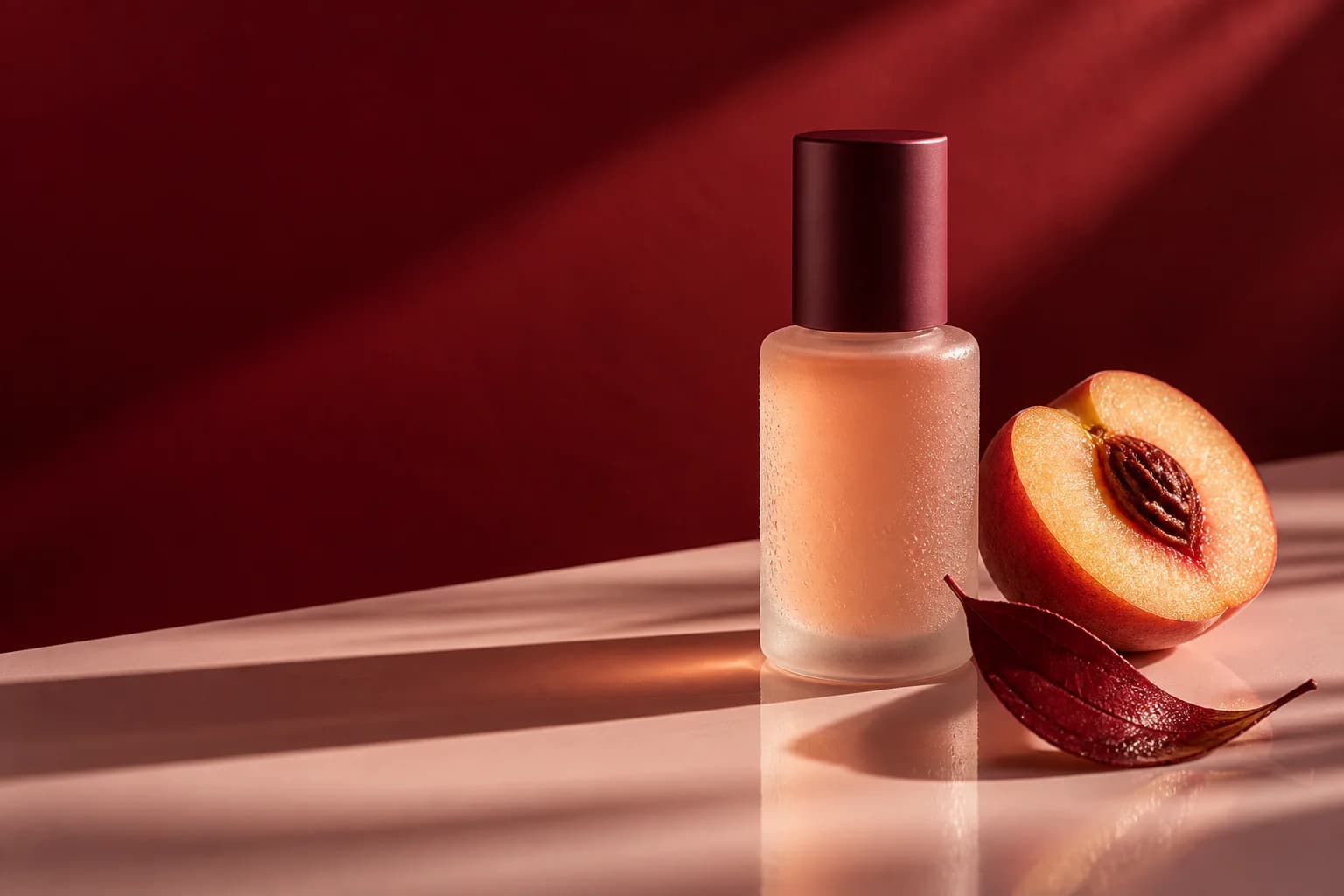
FIELD
Botanical rituals
Make room for a ritual.
What it demonstrates
- Type set inside the photograph rather than stacked above it
- A serif italic carrying the emotional half of the line while the sans carries the plain half
- One deep colour, committed to, and never repeated elsewhere on the page
Where it transfersThe same discipline runs a mobile detailing site: one strong photograph of finished work, one clear promise, nothing competing with either.
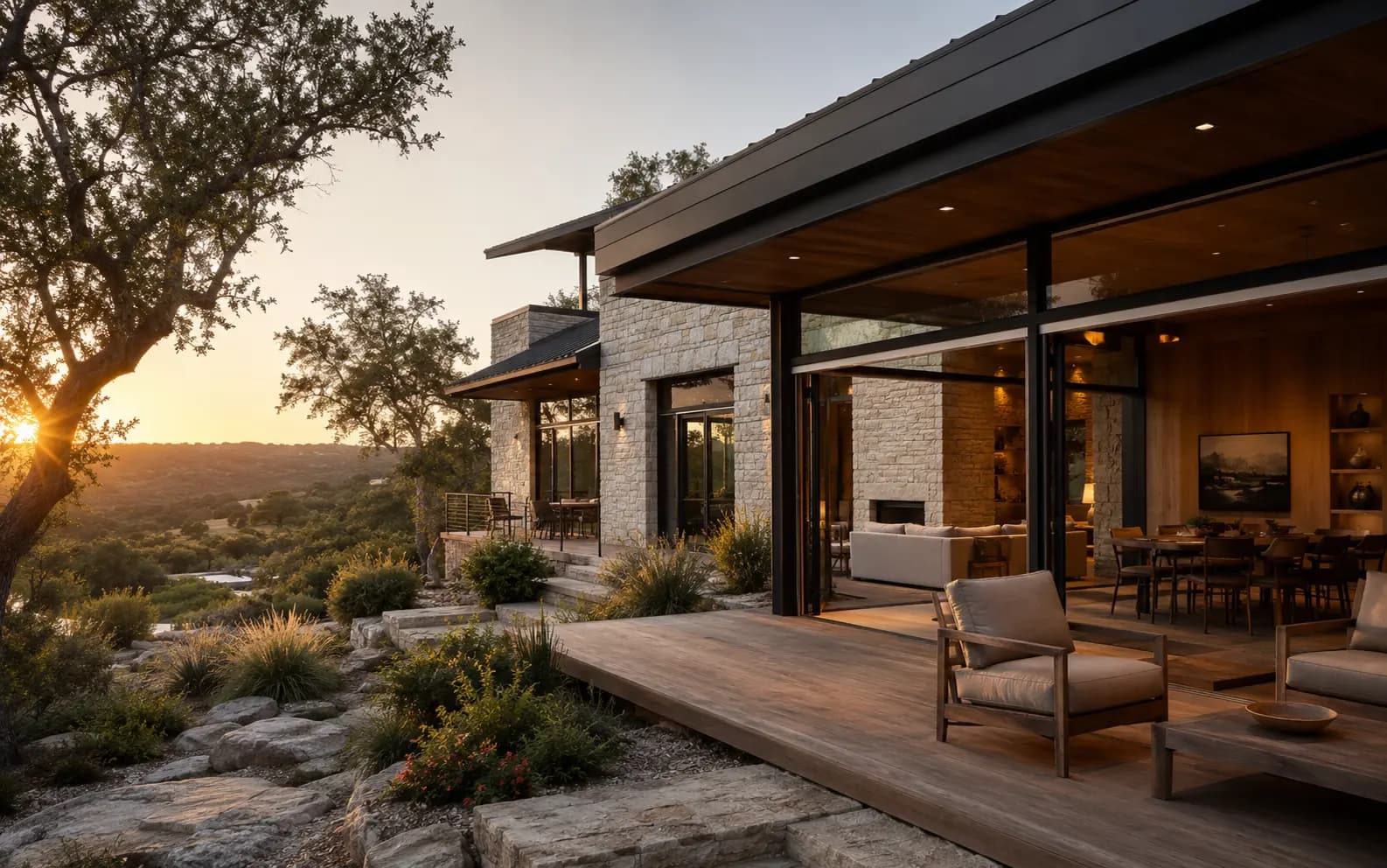
ARC House
Residential architecture
Every house begins with a walk around the site.
What it demonstrates
- Restraint used as the loudest choice on the page
- A type scale with real distance between its steps, so hierarchy needs no colour
- A held-back split where the image is given room instead of being cropped to fit
Where it transfersThis is the register for a painting or carpet cleaning company that wants to read as careful rather than cheap.

FORM / 01
Movement studio
Twelve people. One instructor. No mirrors.
What it demonstrates
- Display type large enough to become the image itself
- High-contrast colour used once at full strength instead of everywhere at half
- Energy built from composition rather than from noise
Where it transfersThe same approach suits a junk removal or pressure washing company: one loud, confident move, everything else kept quiet.

OUT THERE
Seasonal campaign
It should work before you have thought about it.
What it demonstrates
- A full-bleed landscape carrying the page with the smallest possible overlay
- A message that still lands when the image is cropped to a square
- Type weight chosen for legibility over a moving, uneven background
Where it transfersDirectly useful for a lawn care or window cleaning company whose customers find them on a phone, one-handed, mid-errand.

CLARITY
Material study
Colour is structure, not decoration.
What it demonstrates
- Gradation in the photograph doing the work a CSS gradient usually does badly
- A light typographic hand holding its own over a busy image
- Colour used as structure rather than as an accent sprinkled on top
Where it transfersThe reason a photography and videography build can hold a portfolio without the layout fighting the work.
Original work by this studio. Fictional brands, made to test ideas. No client is represented here.
02Being straight about it
Fictional brands, real craft.
Plenty of new studios borrow credibility with logos they have never worked with and testimonials nobody said. We would rather show you work we actually made and tell you exactly what it is.
Describe the company you want.
One sentence is enough to start. We will come back with research, a recommendation, and a plan you can approve or change before anything is built.